Selecting interior paint colors can be daunting task, so today, I’m sharing my process for choosing the right paint color. There’s definitely a right and wrong method for choosing your perfect color, so let’s talk about both of them. When I was a newbie homeowner, here’s the way I typically went about it:
- Drive to local paint store
- Spend 10 minutes looking at color swatches in the store
- Choose a color that looks fabulous on the 1″ x 2″ swatch
- Ask the Paint Guy to mix up a gallon (or more) of hastily selected color
- Stare blankly in response to his question “What sheen do you want?
Sound familiar? On rare occasions, this method led to a good result, but more often than not, I ended up wasting money and time as I realized after painting the first wall that the color was all wrong.
Fast forward to now…I’ve owned 3 different homes across the last 18+ years and have tackled countless DIY painting projects in those homes. Through all that experience, I’ve discovered that that there IS a better process for choosing the right paint color.
STEP 1: CAST A WIDE NET
Once I’ve narrowed down my color choice to a specific hue, I gather a large number of samples that represent variations of the hue…approximately 15-20 sample color chips.

STEP 2: VIEW THE COLORS IN YOUR HOME {VIA LARGE COLOR SHEETS}
Since the perception of a color is so strongly affected by lighting conditions (the fancy term for this phenomenon is called “Metamerism”), it’s almost impossible to make good decisions about what color to put on your walls unless you are making the decision in the actual room that you are painting. So no decision-making takes place in the paint store.
Once you get home, it’s useful to view those itty bitty paint chips as a first step. BUT…it’s so so helpful to get your hands on the larger paint color sheets that the paint manufacturers offer. Benjamin Moore’s color sheets come in 8″x8″, 4″x8″, 5″x9″, or 6″x9″ sizes, depending on the color collection. Sherwin Williams’ color sheet options are similar. You can order their color sheets in 4″x4″, 5″x8″, or 8″x11″ sizes.
STEP 3: BEGIN THE PROCESS OF ELIMINATION
For me, color selection is an iterative process. I begin with one of the color sheets in hand and compare it to each of the others. If you’re like me and talk to yourself out loud during these types of decision-making processes, the monologue sounds something like this…
“Nope. Too dark. This one is a Maybe. Too much gray. Too much green. This one clashes with the carpet. Oooohh, I luuuvvv this one!”
{some of the color choices for our new redesign paint color palette}
A word of advice when you’re going through this process–be aware of how you are viewing your paint chips. The orientation you use you to view the color sheet/paint chip greatly affects how the color looks. Hold your color sheet/paint chips vertically, since this is how it will be viewed on the wall.
{don’t do this}
{do this!}
STEP 4: GRAB YOUR PAINT SAMPLES
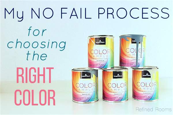
Once I’ve narrowed my colors down to 2-3 “finalists”, I head back to the paint store and purchase color samples of each finalist. Fortunately, all of the major paint manufacturers now offer paint samples so that you can test the actual color on a larger area before spending the big bucks on multiple gallons of paint. I pay close attention to the sheen of the sample paint (e.g., flat, eggshell, etc.), since the sheen will also affect how the color looks.
In the old days, I used the paint samples to paint a large square directly onto the wall over the existing paint color. I’ve since learned that there are two reasons NOT to do this:
1) my perception was influenced by the current wall color.
2) the “test areas” sometimes remained visible even after the walls were painted, especially when one of the sample colors was darker than the final color choice.
So now I always make sample boards. I create these by painting directly on foam board (I typically use 20″x30″ pieces). I paint at least 2 coats; at times, very dark colors require 3-4 coats for adequate coverage.
{Some sample boards I used for determining our new home color palette}
Some of you are probably thinking that this step is overkill.
Remember though, that we perceive colors much differently when they are covering a large surface area (especially when we’re talking about deep and dramatic colors). So to get it right the first time, I strongly suggest NOT skipping this step. The few dollars you’ll fork out to pay for sample paint is money well-spent.
STEP 5: “AUDITION” YOUR COLORS
After the paint on the boards has cured (after a day or so), I “audition” the color finalists for at least 2 days. Remember that thing called metamerism? Basically, it means that colors will look different in the morning, in the daytime, and in the evening under artificial light. During the course of the audition period, I move the sample boards around the room to see how each color looks during various parts of the day/evening.
During this audition time, I also determine how well the paint coordinates with the existing design elements in the space (furniture, flooring, trim color, accessories, window treatments, bedding, etc). I consider when we use the room the most, and pick the color that looks the best during that time of day and is also in harmony with the design elements.
{although gorgeous, this potential color was not playing nicely with my curtain panels or upholstered chair}
STEP 6: HEAD TO THE PAINT STORE…WITH CONFIDENCE
With the paint chip of my winning color in hand, I’m now ready to now purchase my paint! Some final words of advice to keep in mind when it’s your turn to venture off to the paint store:
- Make sure you know the correct sheen level that you need for your various paints(so that you don’t need to rely on the recommendation of the teenager behind the Home Depot paint counter).
- Certain colors will require a tinted primer to ensure optimal coverage. If you’ve selected one of these colors, don’t forget to purchase the primer.
- Typical coverage for a gallon of paint is 400 square feet. Use this as a rough guide for how much to purchase. When in doubt, opt for another gallon, since it’s better to have extra paint at the end of the project than not enough to complete the project. You can always use the extra paint for touchups in the future.
Are you gearing up for a big painting project? Share what it is you’ll be working on!
I sincerely appreciate you giving this fantastic content! My life will be greatly improved by it!
It really helped when you talked about how light affects a color’s shade perception. Recently, my wife and I decided to re-decorate our home. We want to start with the colors of our walls, so we’ll be sure to follow your selection tips. Thanks for the advice on how to know if a color is right for our room’s wall.
I have a question- what do they call that paint sample pack have and how can I get one? thanks!
Paula, Are you referring to actual paint samples? Most paint companies (and home improvement stores) sell individual paint samples. If you are referring to the color fan decks, you can purchase them online or in paint stores.
I used to have a book from The Home Depot where I kept all of my paint selections for my home, organized by room, and a see-thru envelope system for the swatches. I’m kicking my self now because we moved and I left the book behind for the new owners,
Does anyone have any idea where I might pick up something similar?
TIA
Julie Kimbell
I do not, but that sounds like a fantastic organizational tool
It’s good to know that you should get samples or swatches for a wide variety of variations for the hue that you want for your walls when repainting. My brother has been telling me about how he wants to repaint his home, and he wants to make sure that it looks good. I’ll share this information with him so that he can be sure to pick the right color.
That’s good to know that all major paint manufacturers will give you samples so you can test it before painting your wall. This is helpful since I’m looking to repaint my living room since it’s a tan color and I want it to be a light blue. I’ll have to find a paint store I can go to to get samples so I can see which blue will look best in the room.
Yes, samples are key. Best of luck with your project Hazel
What is the best way to the clean brushes after use?
Great question! I actually clean mine by soaking them in hot vinegar. It works like a charm!
How do you suggest picking out colors for a ceiling? I have a stepped ceiling in my dining room and have to pick out three colors! It’s mind-boggling!
Sue
Oh no you don’t Susan! I would advice against painting out the steps in your stepped ceiling different colors. Check out The Decorologist’s advice for how to handle this design dilemma. And the process for choosing the ONE color for the actual ceiling is the same as for the walls. Create sample boards and temporarily adhere them to the ceiling (I use duct tape for mine). Thanks for the great question!