I’ve mentioned that my home has been undergoing some changes in previous posts (here and here). To celebrate National Painting Week, I’m highlighting one of the major changes that has taken place at Chez Gallagher as part of our redesign project…our new and improved paint color palette!
When we originally moved into our home in 2005, I was drawn to warm and dramatic colors, such as golds, khaki green, and reds. Hence, our home originally looked like this:

The objective of my home redesign is to not only change the color palette, but to lose a lot of the traditional design elements, in favor of a more contemporary, clean design.
Oh yeah, another objective is to banish every square inch of wallpaper…
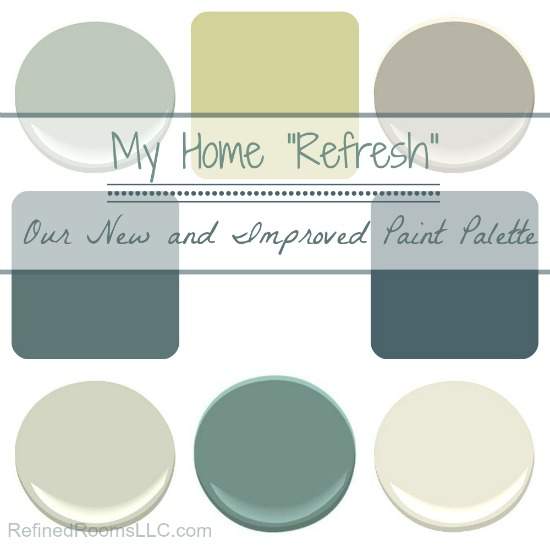
During the last couple of years, I’ve been increasingly drawn to light and airy colors in the blue/green/gray spectrum. So with a little help from Pinterest, my trusty paint sample boards, and color expert Kristie Barnett, I finally decided upon a new paint palette for my home:
My master bathroom and master bedroom were painted Silver Sage and Silver Fox respectively a few years back. I used Calabash on the walls of my daughter’s room last year when we redesigned that space. So the colors in the top row were my starting point when it came time to select the color for the remaining areas of the home. When faced with the daunting task of paint color selection, I often begin by pulling colors from an “inspiration piece” of decor like a vase, piece of fabric, or artwork. For the current project, my inspiration piece took the form of this area rug:
Taking a cue from the rug (which currently lives in the foyer and is the first thing you see when you enter my home), I wanted to incorporate a variety of different blues into the new color scheme, all anchored by just the right neutral color. Selecting blues was a relatively easy task…it was the “perfect neutral” that eluded me for awhile. That’s where Kristie Barnett comes in. Better known as The Decorologist, Kristie is a fellow home stager AND a top color expert in the design world.
I’m a formally trained home stager myself, and typically have no trouble making color specifications for home staging clients. When it came to selecting the primary neutral color to be used on the vast majority of wall space on my 1st floor and 2nd floor hallway (including a 2-story great room and 2-story foyer), I just wanted to be sure I nailed the color selection the first time. After all, these areas likely will not be repainted for another decade!
My I present Benjamin Moore’s Sweet Spring!
This beautiful color is best described as a grey with a green undertone. It’s so fresh, and serves as the perfect neutral background for pops of color. Best of all, it makes living with our orange-tone oak flooring tolerable until the day that we can afford to replace it.
I used Sweet Spring as the main wall color throughout the first floor (foyer, dining room, home office, great room, kitchen), as well as up the stairs and throughout the 2nd floor hallway. Before we painted the kitchen, there was that pesky matter of removing the wallpaper.
All of the horror stories that you’ve heard about this task are absolutely true. Even though we completed all of the appropriate prep work 10 years ago when we applied the paper, it still came off in teeny tiny pieces on most of the walls. Good times.
As part of our kitchen redesign (which is slated to happen next year), we plan to paint the cabinets white. While I’m not a fan of the orange undertone of the maple cabinetry, the green undertone of the paint really goes well with both the cabinets and the existing counter top (which will be replaced).
Are you wondering where the blues come into play? We decided to go dramatic in the powder room with Sherwin-Williams Tempe Star. That transformation also required wallpaper removal (sigh).
This room is not quite ready for the big reveal, but I’ll give you a sneak peek of how the new color looks:
Sherwin-Williams Riverway has always been a color favorite, and I couldn’t wait for the opportunity to incorporate it into the new color palette. And now for the unexpected…instead of using it as a wall color, I decided to use it as an accent color on the dining room ceiling…
and directly across the foyer in my home office on the back of my bookcase:
Currently, the only completed project in our laundry list of redesign projects is the dining room. Drumroll, please:
{Please disregard the blue painters tape that’s marking where I need to make paint touch ups…this was the one room that I painted myself!}
Quite a difference from where we started, don’t you think?
As for the remaining 2 colors in the palette, Benjamin Moore’s Mountain Laurel will be used in the laundry room and my husband’s home office. Benjamin Moore’s White Down is the color of our trim work throughout the house.
I’ll be sure to keep you posted as we complete each room in the master plan. I’ve learned a few lessons along the way that I plan to share with you as well in future posts in the My Home Refresh series. Feel free to check out my home redesign Pinterest boards as well!
Check out our whole home redesign progress to date in the My Home Refresh Series:
- Printables for Organizing Home & Life: The ULTIMATE Organizing Printables Vault! - November 28, 2023
- Clipboard Wall Organization for Papers: Easy DIY Paper Storage! - September 4, 2023
- How to Plan a Graduation Party to Remember: The Ultimate Graduation Party Planner - May 9, 2023
Chelsea says
My fiancé and I just bought a house and I LOVE this color palette! Decor is not my strong suit so it’s nice to have blogs like this! Did you paint the doors and trim the white down or just the trim? If not both the white down, what did you do with the doors? Thanks!!
Natalie Gallagher says
Hi Chelsea,
Thanks for the compliment! Yes, the trim in our home is painted white down, and believe it or not, all of my interior doors are painted black! But, prior to that, the doors were painted with the same color as trim. Hope this helps and thanks for stopping by!
Laura says
Love the dining room, can you give the source for the chairs and inspiration rug?
Thanks, Laura
Natalie Gallagher says
Laura,
I’m so glad you like it! The inspiration rug was a purchased at AllModern.com, the green leather chairs were sourced from Pier 1 Imports, and the blue chairs are a T.J.Maxx/Marshalls score!
Danielle says
I love your color pallette, would love to see more photos of your new modern designs! We are moving soon to an outdated interior home, I can’t wait to get some projects like this started.
Natalie Gallagher says
Hi Danielle,
Thanks for stopping by! I will definitely be posting more photos as the redesign unfolds throughout the year. The upside of moving into an outdated home is that you get to start fresh and really make it your own! I wish you best of luck on your home improvement projects. You should head over to the “Products I Love” page of my website and checkout HomeZada, which would be a great tool for you to use during your remodel/redecorating process.